Spatial Interfaces
Prototyping what 3D space actually buys an interface designer, from depth as hierarchy to physicality as feedback, and which parts are just demos.
Spatial interfaces are what happens when the screen stops being a rectangle and starts being the room. This experiment is my attempt to figure out which parts of that are real interaction design and which parts are demo theater. After twenty years of designing for glass, I can tell you most of what I've seen in headsets is theater.
The tell is simple. A demo optimizes for the first thirty seconds. An interface has to survive hour three. Floating panels arranged in a majestic arc look incredible in a keynote and are exhausting by lunch, because your neck is not a cursor.
Space is a budget, not a canvas
When the environment is the canvas, the hard problem isn't where to put things. It's where not to. Designers raised on 13-inch constraints get drunk on infinite space and spread the interface across it like it's free. It isn't. Every degree of head turn, every refocus between depths, every reach: that's the user paying. Twenty years of screen design taught us to spend pixels carefully. Spatial design is learning to spend the user's body carefully, and almost nobody is doing that math yet. So I started doing the math — drag the panels between depth bands and watch what each layout costs:
×1.0the cheap layout — hour three
Boring on purpose. Tools in reach, reading at mid-depth, status on the wall.
Depth is the one genuinely new tool
Here's what 3D actually buys you, and it's not immersion. It's that z-depth becomes a real information channel instead of a faked one. In 2D we spent decades simulating hierarchy with shadows, blur, scale, and an entire material metaphor built to imply layers that don't exist. In space, the layers exist.
My working structure has three bands. Arm's reach, roughly half a meter to a meter, is for tools and precision, the things you manipulate. One to three meters is reference: documents, secondary views, things you read but don't touch. Beyond three meters is ambient: status, environment, the peripheral awareness a wall calendar used to give you. The bands matter because focal distance becomes a preattentive cue: you know something is actionable before you've read a word of it, purely from where it sits.
Move the cards farther from you. Which one can you still use?
Both are tools. The verbs are real because you can be precise here.
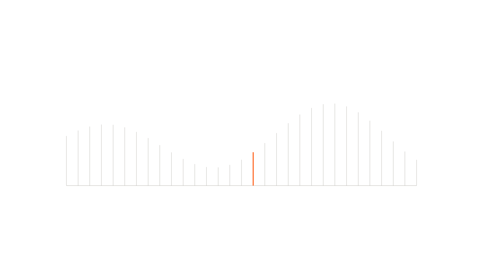
I ran a flatter version of this problem on Android: one primitive traveling a density curve across the room. That's a capability flat screens structurally cannot offer, and it's the one that keeps me interested in this space despite the hype fatigue.
Interfaces need physics, not skeuomorphism
The other real question is feel. A button on glass has a pressed state and we're done. A button floating in air has nothing: no surface, no resistance, no confirmation. Every ounce of that feedback has to be manufactured through visual displacement, sound, and haptics if there's a controller in hand. Skip it and interactions feel like touching a ghost. Users double-press, hesitate, lose trust.
So the design work becomes writing physics. Does a window have mass when you grab it? Does it snap or drift? Does a dismissed panel fall, fade, or fly? None of these have defaults yet, which is the honest reason this experiment stays in-progress: we are where 2D was before scrolling had a direction everyone agreed on. My bet is that the conventions that win will be the boring ones, optimized for hour three instead of the keynote. That's usually how it goes. The demo dies; the discipline remains.